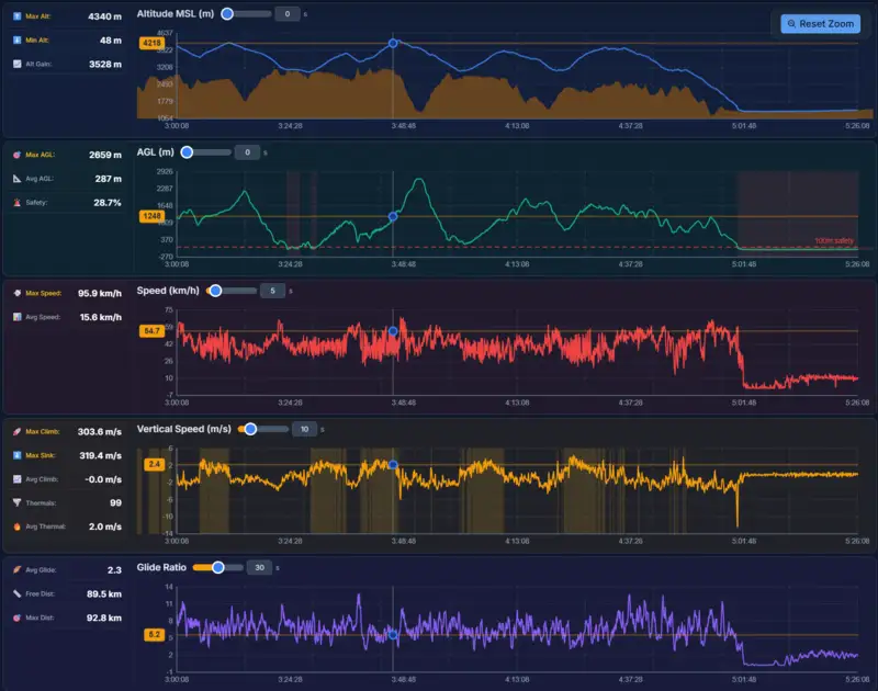
Dive into synchronized flight graph analysis with linked altitude, vario, speed, and wind curves. Every graph is connected to the 3D map, so scrubbing the timeline highlights the exact position on your track, making it easy to correlate data with terrain and decisions.
What you get
- Linked flight graph analysis with altitude, climb rate, ground speed, and air speed.
- Synchronized timeline scrubbing between graphs and 3D map position.
- Vario and energy graph overlays for understanding thermal efficiency.
- Wind vector estimation displayed as both graph and map overlay.
- Customizable graph panels to choose which metrics to display side by side.
- Export-ready graph snapshots for post-flight reports and analysis documentation.
Why it matters for you
- Turns raw numbers into visual stories through intuitive flight graph analysis.
- Quickly identifies weak points in your transitions and thermal technique.
- Links every data point to its geographic context for deeper understanding.
- Supports structured pilot progression with evidence-based debriefing.
Related features

Flight Comparison in Sync
Replay multiple pilots side-by-side to compare tactics, match thermals, and learn from every glide.
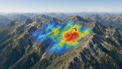
Thermal Overlay by KK7
Layer KK7 thermal hotspots over your route to understand convection strength and plan efficient climbs.
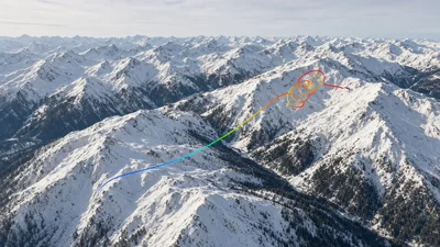
Path Colorization
Color-code your track by altitude, climb rate, speed, or glide to surface the story behind every line.